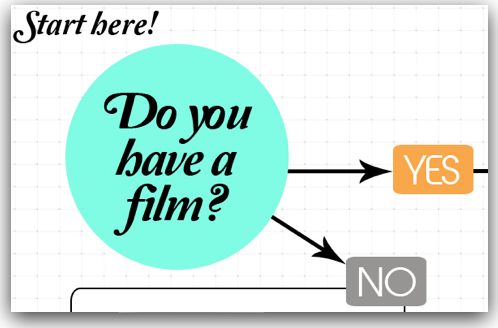
This tongue-in-cheek flow chart is one of the cleverer ways I've seen of communicating a film programming ethos. There are plenty of "joke" dead-ends here (I especially like the hackneyed-but-still-funny thrashing of the Comic Sans typeface), but also a serious path through to festival acceptance that reveals the qualities in a film that these programmers want.
The creators of the Lower East Side Film Festival (often shortened, somewhat misleadingly, as LESFilmFest) seem to have done a great job in their inaugural year of creating an identity for their festival. I also see some interesting experiments going on here (like the "QuickSubmit" tool that allows filmmakers with private screening videos on YouTube or Vimeo to bypass the usual submissions process).
I'm looking forward to seeing what they do in 2013.


